
How Arcade Cabinet Artwork Sold the Fantasy Before You Inserted a Coin

Before the first coin dropped, the cabinet had already begun telling the game’s story. An arcade cabinet had only seconds to stop you walking past. In a room full of flashing screens, attract-mode sounds and competing marquees, its artwork had to promise an experience before you knew how the game moved. The cabinet was not […]
Why Space Invaders Pixel Art Became Iconic—and How I Turned It Into Layered Wall Art

Why did Space Invaders pixel art become iconic? Explore the 1978 arcade graphics and see how I transform the invaders into handmade layered wall art.
10 Most Iconic Nintendo Villains—and How Their Graphics Made Them Unforgettable
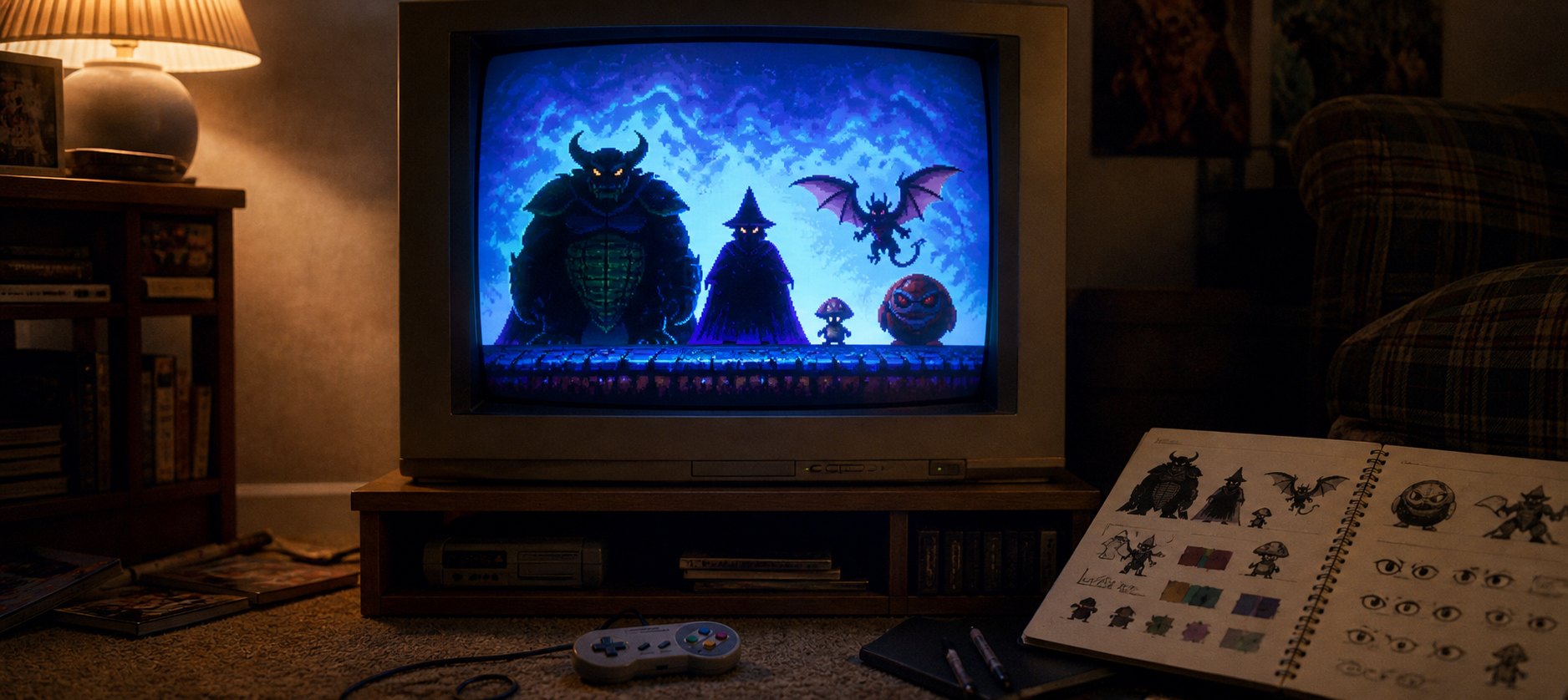
A visual history of 10 iconic Nintendo villains—from Bowser and Ganon to Ridley and Boo—and how silhouette, colour, animation and scale made them unforgettable.
Why Mega Drive Games Looked Darker and Sharper Than SNES Games
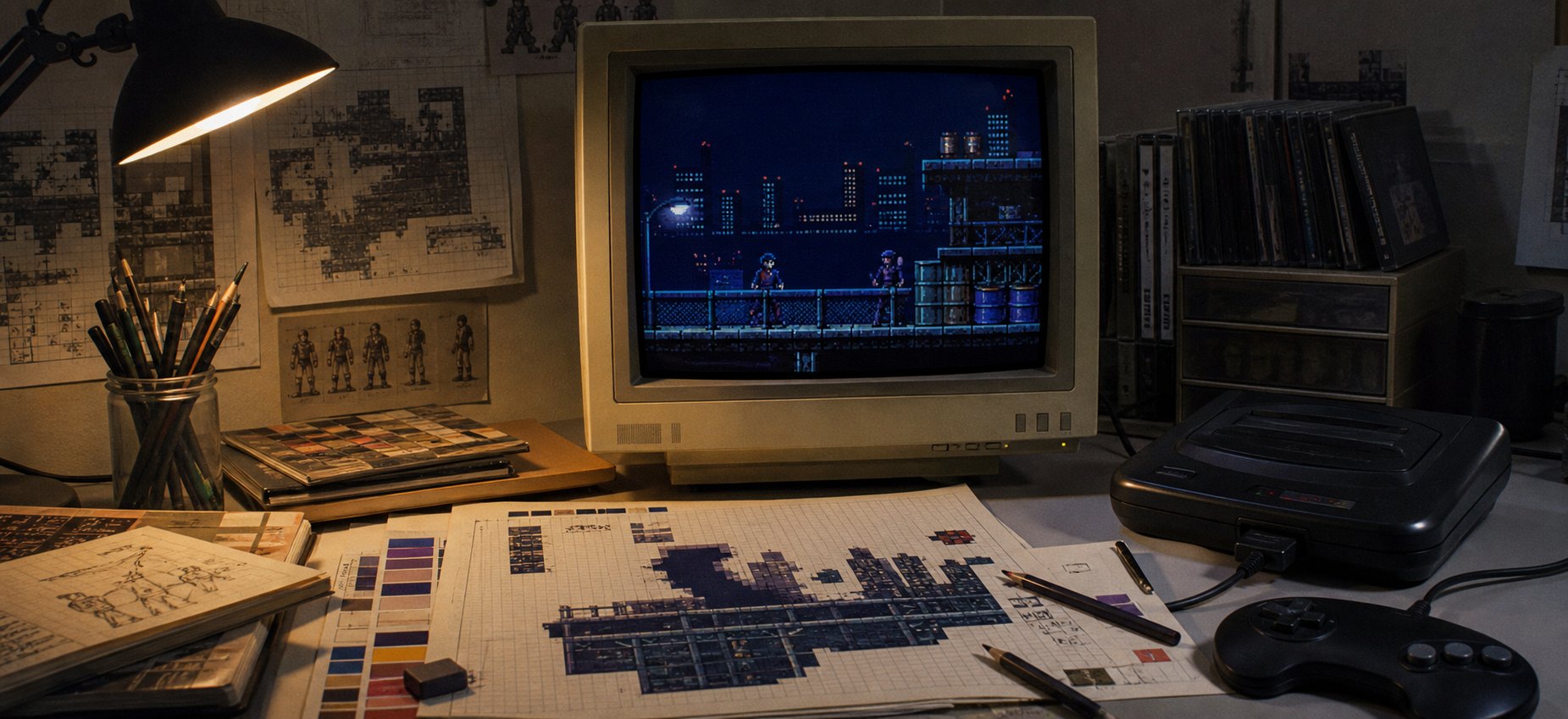
Why did so many Mega Drive games look darker and sharper than their SNES counterparts? A close look at palette limits, dithering, resolution, CRT output and the artists who turned hardware pressure into style.
How SNES Pixel Art Created Depth, Colour and Atmosphere
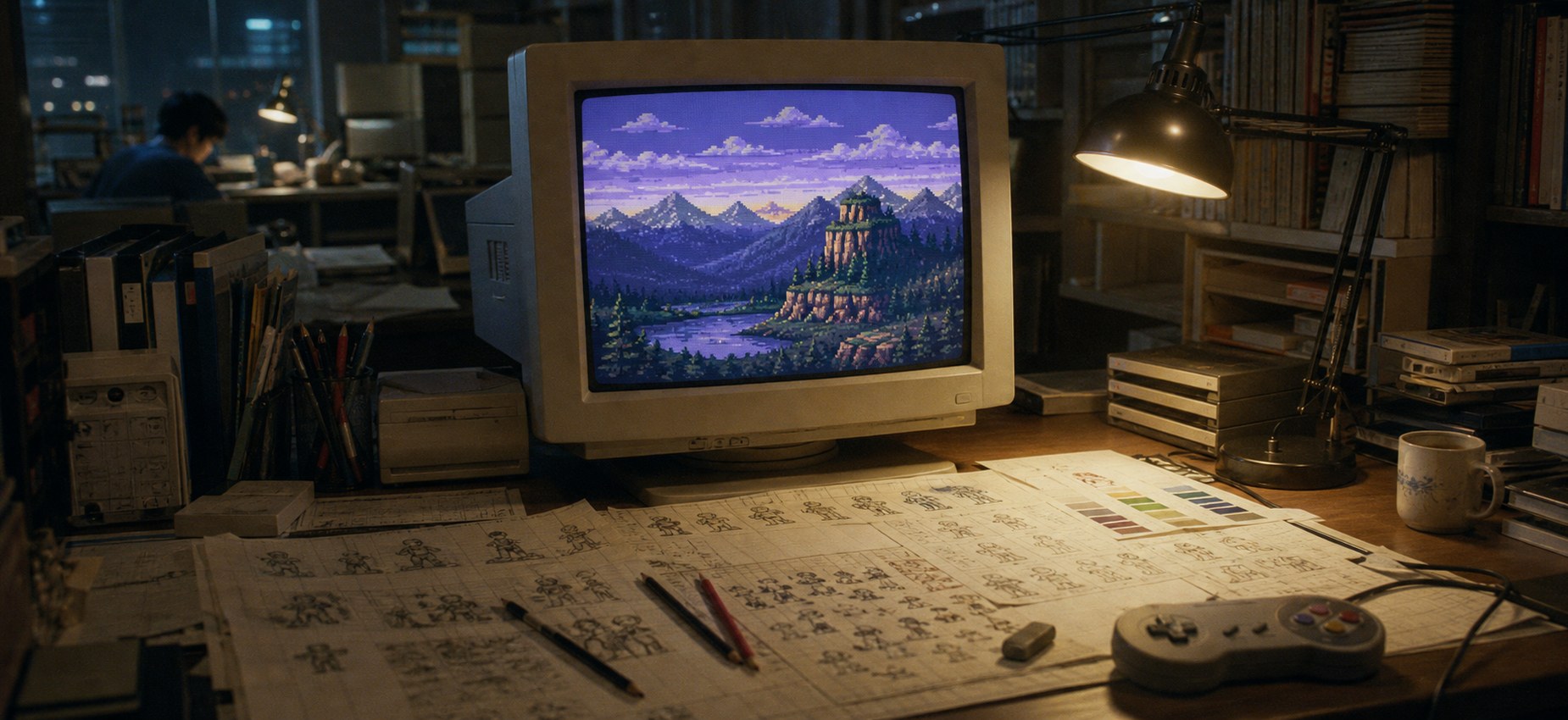
A deep look at how SNES artists used palettes, tiles, sprites, layers, Mode 7 and CRT displays to create unforgettable 16-bit worlds.
Cadillacs and Dinosaurs – A Pixel Art with Bite
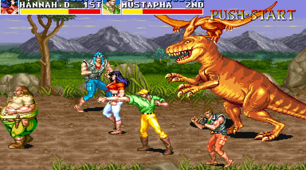
Cadillacs and Dinosaurs is one of Capcom’s most visually distinctive arcade beat ’em ups. Released in 1993 and based on Mark Schultz’s Xenozoic Tales, it combines ruined cities, 1950s American cars, comic-book heroes and roaming dinosaurs in a world that should feel chaotic—but is held together by remarkably clear pixel art. This is not simply […]
Super Mario World Pixel Art: Why the 16-Bit Style Endures
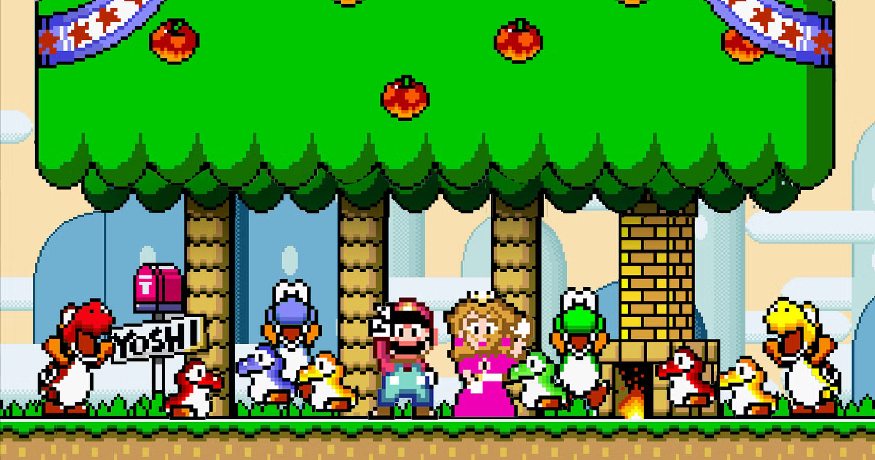
Super Mario World pixel art still feels remarkably clear, expressive and inviting more than three decades after the game first appeared. That staying power is not simply nostalgia. Nintendo’s artists built a visual language in which colour, silhouette, animation and level tiles all help the player understand what to do next. What makes Super Mario […]
Bringing the horror of Splatterhouse 2 to life in Pixel Art
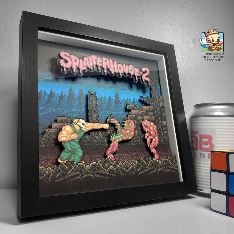
Splatterhouse 2 pixel art turns the Sega Mega Drive’s technical limits into a distinctive form of horror. Its masked protagonist, bruised colour palettes and grotesque enemy silhouettes do not rely on photorealism. They create dread through suggestion, animation and the uncomfortable contrast between arcade action and haunted-house imagery. See the Splatterhouse 2 shadow box in […]