
Super Mario World pixel art still feels remarkably clear, expressive and inviting more than three decades after the game first appeared. That staying power is not simply nostalgia. Nintendo’s artists built a visual language in which colour, silhouette, animation and level tiles all help the player understand what to do next.

What makes Super Mario World’s pixel art distinctive?
The game sends Mario and Luigi into Dinosaur Land, where they meet Yoshi and travel through a connected world on the way to Bowser. That new setting gave the artists room to move beyond the familiar bricks and pipes of earlier Mario games. Forests, caves, ghost houses, fortresses, mountains and underwater stages each have their own palette and decorative rhythm, yet every screen still belongs to the same coherent world.
Good pixel art is not miniature painting. It is design under constraint. Every cluster of pixels has to describe form, movement or function without making the screen noisy. Super Mario World succeeds because its art is economical: the important shapes are bold, background detail is controlled, and interactive objects remain legible even when the action becomes busy.
Colour creates an instant visual hierarchy
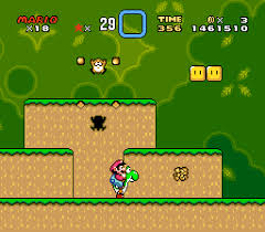
The game uses colour to separate foreground action from scenery. Mario’s red cap, Yoshi’s saturated green body, yellow question blocks and bright enemies stand clearly against softer skies, hills and distant terrain. Players can therefore read the route at a glance. Platforms feel solid, hazards announce themselves, and collectible objects draw the eye without an interface marker pointing at them.
Palettes also establish mood. The cheerful greens and blues of Yoshi’s Island make the opening feel welcoming; deep blues and muted stone colours make caves feel enclosed; stark architecture and lava give castles an immediate sense of danger. These changes are dramatic enough to make areas memorable but disciplined enough to preserve readability.
Mario and Yoshi are readable in motion
A strong sprite must work as a still image and as part of an animation. Mario’s cap, nose, overalls and compact pose form a recognisable silhouette, while small changes in his limbs communicate running, jumping, climbing and swimming. The larger SNES-era sprite gave the artists more room for facial detail without losing the character’s clarity.
Yoshi is equally efficient. His long nose, rounded back, saddle and orange shoes make him identifiable from almost any pose. Animations such as extending his tongue or fluttering during a jump exaggerate the action just enough to communicate timing. Mario and Yoshi remain visually distinct when combined, which matters because the player needs to read two characters as one moving unit.
Tile-based scenery gives every area an identity
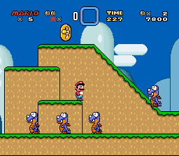
SNES levels are assembled from reusable visual tiles, but the best stages rarely feel mechanical. Slopes, ledges, bushes, clouds and repeated ground textures are arranged into convincing landscapes. Curved hills and layered horizons soften the grid, while repeating motifs create a steady visual rhythm that supports the pace of play.
The backgrounds are decorative without competing with the route. Distant forms tend to use lower contrast and simpler detail, while the playable layer receives sharper edges. This separation is one reason screenshots remain easy to understand today, even on a small display or when translated into a physical layered artwork.
Visual clues reward curiosity
Super Mario World is famous for secret exits and alternative routes, and its art quietly encourages experimentation. Unusual pipe placement, a suspicious gap, a differently coloured block or a tantalising object beyond the obvious path can suggest that a level has more to reveal. These clues do not give the answer away; they make exploration feel like the player’s own discovery.
The overworld reinforces that idea. Paths, landmarks and switches turn progress into a visible transformation of Dinosaur Land. The map is more than a level menu: it is a compact illustration of the adventure and a promise that apparently separate places may connect.
Why the 16-bit style still holds up
The art has aged well because it prioritises communication over surface detail. Modern games can render vastly more information, but more information is not automatically better design. Here, silhouettes are deliberate, palettes are purposeful and animations focus on the exact moment a player needs to read.
That discipline also gives the game warmth. Tiny expressions, playful enemies and elastic movement make Dinosaur Land feel inhabited. The pixels are visible, yet they never feel like a limitation to apologise for. They are the medium through which the game develops its character.
From game screen to layered pixel art
A memorable Super Mario World scene already contains natural depth: a distant sky, mid-ground hills, the playable terrain, characters and foreground objects. Separating those planes in a shadow box makes the original composition easier to study while preserving the crisp geometry of the sprites.
For a closer look at that process, see the guide to a Super Mario World pixel art shadow box. The companion feature on the Yoshi’s Island 2 shadow-box scene focuses on one of the game’s most recognisable early moments. You can also explore more essays in Game Art & Culture.
For the wider technical story behind those colour, sprite and background choices, read how SNES pixel art created depth, colour and atmosphere.
The lasting lesson is simple: technical limits do not prevent rich visual storytelling. When every colour, edge and movement has a purpose, a 16-bit world can remain readable, charming and culturally recognisable for generations.