Splatterhouse 2 pixel art turns the Sega Mega Drive’s technical limits into a distinctive form of horror. Its masked protagonist, bruised colour palettes and grotesque enemy silhouettes do not rely on photorealism. They create dread through suggestion, animation and the uncomfortable contrast between arcade action and haunted-house imagery.
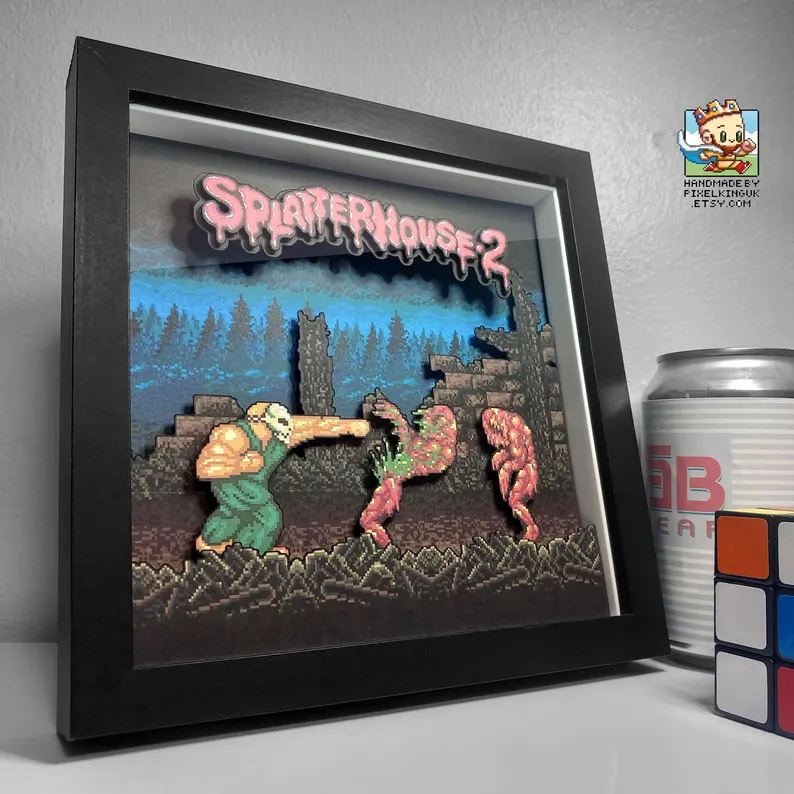
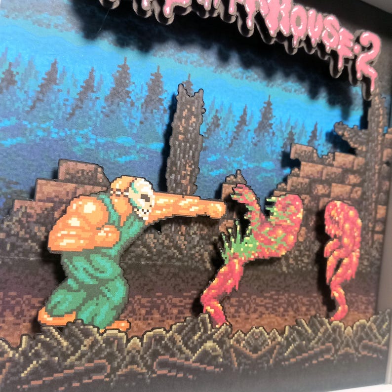
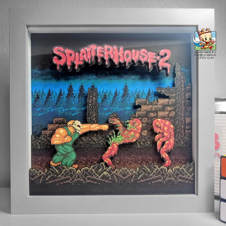
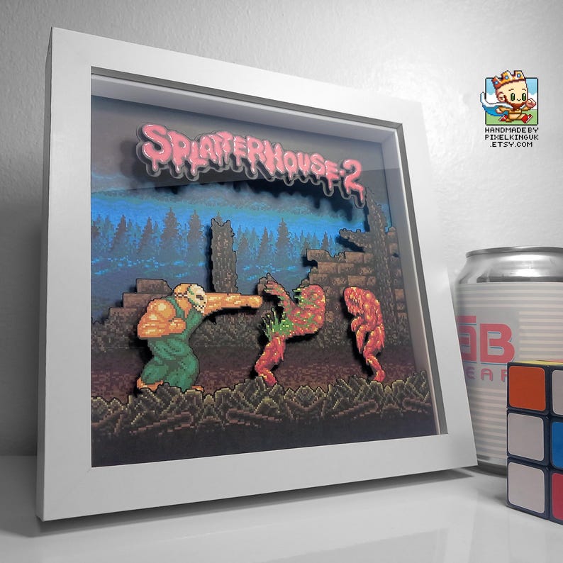
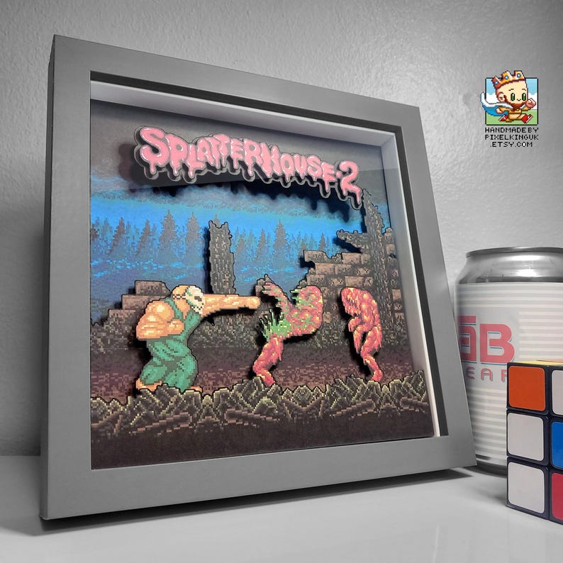
See the Splatterhouse 2 shadow box in motion
The changing camera angle makes the spacing between the horror-game artwork layers much easier to see than a still photograph alone.
What is Splatterhouse 2?
Released for the Mega Drive/Genesis in 1992, Splatterhouse 2 continues Rick’s story after the original arcade game. Drawn back by the Terror Mask and the possibility of saving Jennifer, Rick moves through ruined buildings, sewers and other nightmarish spaces while fighting creatures that look part monster, part bodily nightmare.
The structure is straightforward side-scrolling action, but the presentation gives it personality. Movement is heavy rather than acrobatic. Enemies crowd the narrow route. Doors, chains, stonework and organic growth make each room feel hostile before anything attacks.
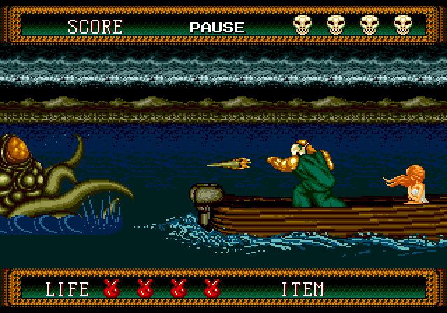
Rick’s silhouette carries the horror
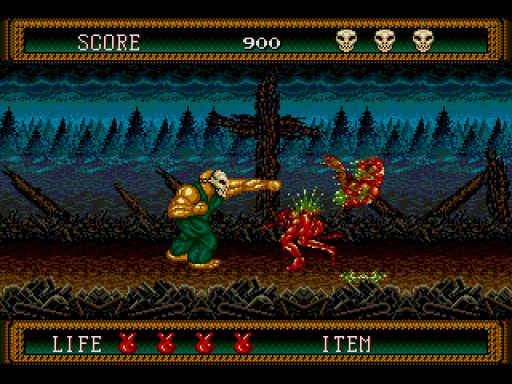
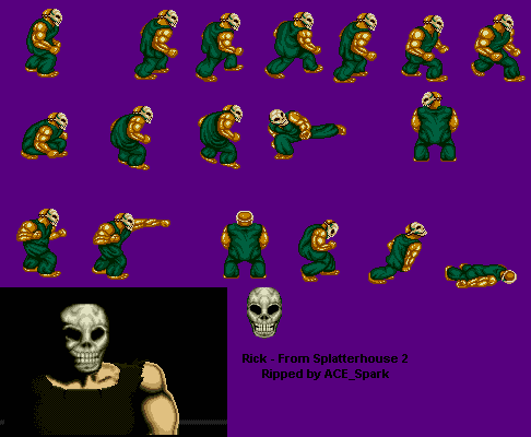
Rick is built from a few powerful shapes: a broad torso, heavy arms, dark clothing and the pale Terror Mask. The mask is the smallest but brightest part of the sprite, drawing attention to a face that reveals almost no humanity. His slow, forceful stance separates him from the agile heroes common to early-1990s action games.
That silhouette also makes combat readable. A raised weapon, a forward punch or a recoiling body can be understood from pose alone. The animation is deliberately blunt, which gives every impact weight and supports the sense that Rick is surviving through strength rather than finesse.
How 16-bit colour creates unease
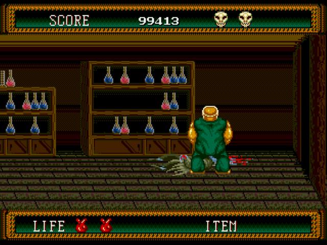
The game frequently places muted browns, greys and dirty greens around brighter flesh tones and sudden red accents. Backgrounds remain dark enough for enemies to stand forward, but they rarely become empty black space. Pipes, masonry, roots and stains give the shadows texture.
Restricted colour becomes an advantage. Instead of describing every wound or surface realistically, the artists use clustered pixels that the player’s imagination completes. A few highlights can make a creature appear wet; an irregular outline can suggest exposed bone; a pulsing animation can make an otherwise simple mass feel alive.
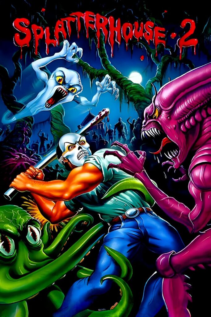
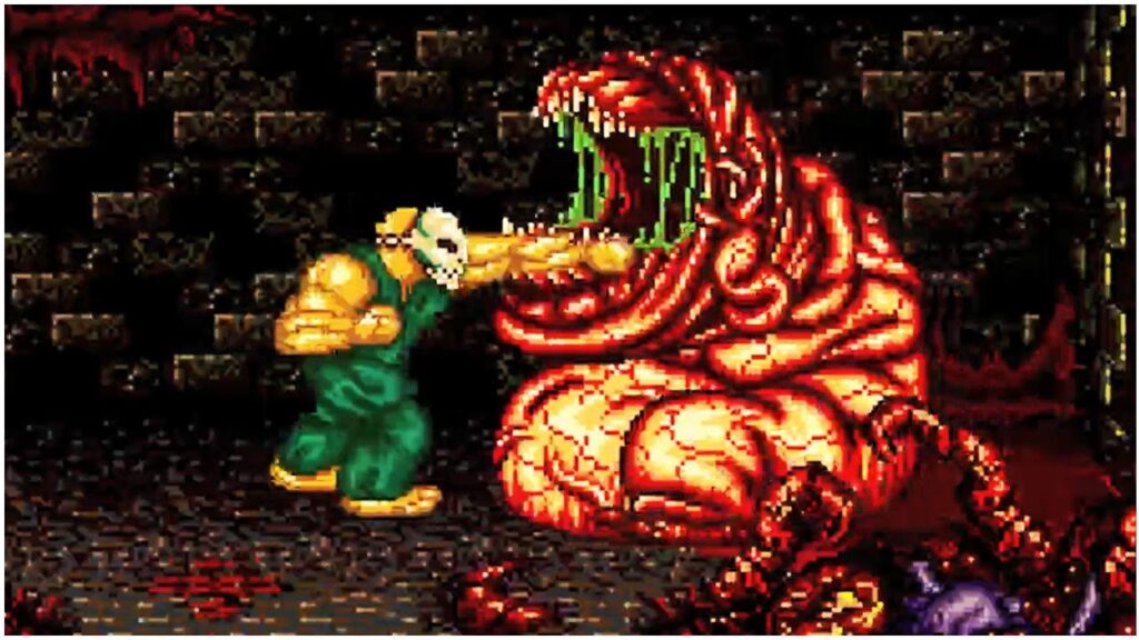
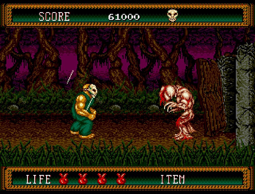
Monster design between clarity and disgust
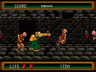
Enemies need to be repulsive and mechanically legible at the same time. Their weak points, attack poses and direction of movement must remain clear during combat. Splatterhouse 2 solves that problem with exaggerated anatomy: hunched backs, oversized jaws, dangling limbs and asymmetrical bodies create memorable shapes before the finer details are noticed.
Animation supplies the most disturbing information. Creatures twitch, split, crawl or collapse in ways that imply more detail than a still sprite can hold. The effect is closer to practical creature work than polished illustration: texture, timing and silhouette do the emotional work.
Backgrounds tell a story without dialogue
The environments establish what kind of place Rick has entered. Domestic architecture becomes corrupted, mechanical spaces feel diseased, and repeated doors or passages create the sensation of being trapped inside a structure that should have been abandoned. Decorative details often blur the boundary between building and body.
This environmental storytelling is efficient. A level does not need a long explanation when cracked walls, hanging shapes and unnatural growth already communicate neglect and danger. The player understands the mood while continuing to move.
Why Splatterhouse 2 pixel art remains memorable
The graphics endure because they are specific. Rick cannot be mistaken for a generic action hero, and the game’s combination of masked slasher imagery, body horror and side-scrolling combat has a visual identity of its own. The pixel grid softens some explicit detail, but it also invites the viewer to imagine what is missing.
Modern horror often uses darkness and realism; Splatterhouse 2 shows how a limited palette and a handful of animation frames can create equal discomfort. Its artwork is a useful study in choosing the minimum visual information needed to produce a strong response.
From horror game screen to layered artwork
A Splatterhouse scene naturally divides into architectural background, playable floor, enemies, Rick and foreground debris. Separating those planes in a shadow box gives the corridor genuine depth and makes the masked figure stand clear of the environment. Real shadows strengthen the gloomy palette without covering the sprite work.
The handmade frame shown here translates that visual hierarchy into physical layers. For another darker game scene rebuilt with real depth, explore the classic Doom pixel art shadow box. You can also read the Cadillacs and Dinosaurs pixel-art analysis, while more essays on how games communicate through images are collected in Game Art & Culture.
Current handmade designs and availability can be found in the PixelKingUK Etsy shop.