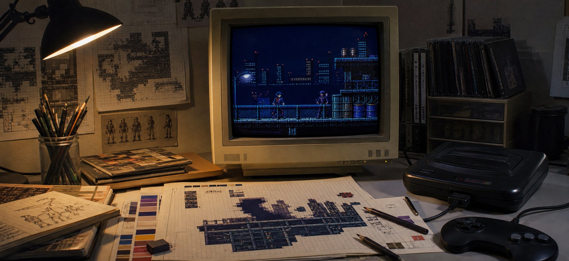
The Mega Drive did not simply have “worse colour” than the SNES. It had a different set of visual pressures—and artists turned those limits into an identity. Darker backgrounds, harder outlines, visible dithering and fast, clean silhouettes made many Mega Drive games feel sharper and more aggressive than their Nintendo counterparts.
Put Streets of Rage 2, Thunder Force IV or Splatterhouse 2 on a CRT and the screen seems to bite. Blacks feel black, highlights are economical, and every important shape reads at speed. That look was partly hardware, partly television technology and partly art direction. The interesting bit is how those ingredients worked together.
Mega Drive and SNES graphics: the useful comparison
The headline figures explain the artists’ starting point, but not the finished artwork. Sega’s own development documentation describes four 16-colour palettes chosen from a 512-colour master range, with the first entry in each palette serving special transparency/background duties. Nintendo lists a far larger 32,768-colour range and up to 256 colours on screen for the SNES.
| Visual constraint | Mega Drive | Typical artistic response |
|---|---|---|
| Master colour range | 512 colours | Choose decisive hues and reuse them carefully |
| Working palettes | Four groups of 16 | Strong ramps, shared shadow colours and graphic outlines |
| Common wide mode | 320 × 224 pixels | Fine horizontal detail and crisp silhouettes |
| Scrolling | Two scrolling playfields plus a window layer | Parallax, speed and layered environments |
| TV output | RF, composite or RGB depending on model and region | Dither patterns could blend—or remain deliberately gritty |
The SNES could build smoother gradients and subtler colour relationships more readily. Mega Drive artists often had to make a smaller set of hues do several jobs. That did not force every Sega game to look dark, but it rewarded contrast, colour sharing and careful separation between foreground and background.
Why a smaller palette can produce a harder image
Imagine drawing a blue jacket. With many shades available, you can model it with a gentle transition from navy through mid-blue to a pale highlight. With fewer palette slots, each step has to earn its place. An artist may keep a near-black shadow, one saturated blue and a bright edge highlight. The transition is less smooth, but the form becomes instantly readable.
That is one reason Mega Drive graphics can look “sharper”. It is not conventional image sharpness. It is shape clarity: larger jumps in value, firmer outlines and fewer ambiguous middle tones. In motion, especially through analogue television blur, those decisions helped characters survive busy scenery.
Artists also reused dark colours across an entire scene. A deep blue might describe a building’s shadow, the underside of a car and the darkest fold in a character’s clothes. This palette economy ties the screen together. It is particularly effective in night stages, industrial levels and horror games, which is why the console’s reputation became associated with moodier art.
Dithering was not a flaw—it was another colour
Dithering places two colours in a repeated pixel pattern so that, at normal viewing distance, the eye mixes them into an apparent third tone. On a clean digital capture it can resemble a mesh or checkerboard. Through composite video on a 1990s CRT, neighbouring pixels often softened into one another, making the same pattern behave like a rough transparency or gradient.
Mega Drive artists used dithering for skies, smoke, metal, skin and shadow. The technique stretched a limited palette, but it also created texture. Even today, artists deliberately preserve those patterns because perfectly smooth gradients would lose some of the machine’s character.
This is why online screenshots require care. An emulator’s razor-sharp pixels show the source artwork, while a CRT photograph shows the image as many players experienced it. Neither view is dishonest; they answer different questions. To understand the art, it helps to look at both.
The 320-pixel-wide advantage
Many Mega Drive games used a 320 × 224 display, whereas a great deal of SNES artwork used a 256-pixel-wide mode. The comparison is not universal—both machines supported multiple modes—but those extra horizontal pixels gave Sega artists room for finer line work, slimmer letters and detailed scenery.
Resolution alone did not make an attractive game. More pixels also meant more artwork to draw and more visual information to control. The best teams paired the wider image with disciplined contrast. That combination—fine detail plus hard-edged value changes—is what often reads as the classic sharp Mega Drive look.
Sonic the Hedgehog 2: clarity at speed
Sonic the Hedgehog 2 is colourful enough to disprove the idea that Mega Drive games had to be gloomy. Its cleverness lies in separation. Sonic’s saturated blue body, peach face and bright red shoes remain distinct from Green Hill-style vegetation, chemical factories and casino lights. Background detail is plentiful, but the playable character keeps a compact, recognisable silhouette.
Checker patterns, alternating highlights and bold dark outlines create texture without sacrificing speed. Scrolling layers give distance to clouds, buildings and machinery. The palette is not trying to imitate a photograph; it is organising the screen so the player can read slopes, hazards and motion almost instantly.
That visual organisation is one reason Sonic artwork translates so naturally into layered physical art. The original scene is already built from strong planes, silhouettes and separated colour groups—exactly the qualities I look for when deciding how to turn a game image into a shadow box. You can see that process in my Sonic the Hedgehog 2 pixel-art feature.
Streets of Rage 2: a city built from selective light
Streets of Rage 2 may be the clearest expression of the “dark and sharp” reputation. Its streets are not full of colour everywhere. Large areas are held in navy, brown and near-black, allowing shop signs, windows, skin tones and attack effects to flare against them.
The artists frequently reserved the brightest colours for information that mattered: a face, a weapon, a pool of artificial light or the edge of a moving limb. Brickwork and road surfaces use short value ramps and patterned texture. The result feels rich not because every pixel is unique, but because the light is rationed intelligently.
Thunder Force IV: metal, speed and controlled chaos
Technosoft’s Thunder Force IV demonstrates how much apparent depth could emerge from scrolling layers and palette discipline. Mechanical landscapes are divided into bands of different speed. Dark structures frame bright projectiles, while tiny highlights pick out armour panels and machinery.
A shoot-’em-up can become unreadable in seconds. The player ship, enemy fire and background all compete for attention. Strong outlines and narrow, high-contrast ramps prevent the screen becoming visual soup. The art feels detailed, but its hierarchy is ruthlessly practical.
Splatterhouse 2: horror through omission
Splatterhouse 2 benefits from what the palette cannot show. Caverns, corridors and ruined spaces sink into darkness, so a pale mask, a red wound or a sickly highlight carries disproportionate weight. The restricted colour steps make surfaces feel coarse and hostile rather than polished.
That is not merely a technical workaround. It is horror art direction. Empty black space lets the imagination finish the scene, and the hard boundary between a character and the darkness makes every encounter feel staged. I explored that visual language more closely in my article on the gory glory of Splatterhouse 2.
Gunstar Heroes: limits turned into spectacle
Gunstar Heroes pushes in a different direction. Its appeal is not darkness but kinetic invention: rotating forms, huge bosses, explosions and sprites assembled into objects that appear to bend the rules. Here the palette’s strong steps help the mayhem. Bright effects pop cleanly against darker scenery, while consistent outline colours stop multipart enemies falling apart visually.
The lesson is important: Mega Drive character did not mean one colour scheme. It meant artists understanding which details the hardware and television would preserve, then designing around those priorities.
Why cross-platform screenshots can mislead
It is tempting to place the Mega Drive and SNES versions of a game side by side and declare that one console was brighter, sharper or more powerful. Sometimes the comparison is useful. Often the ports were made by different teams, at different times, from different source art. Cropping, aspect ratio, emulator settings and video filtering can further change the result.
A fair comparison asks more than “which has more colours?” Look at how each version groups shadows, separates characters, animates large objects and handles scrolling. The interesting question is not which specification wins, but which artistic decisions make the most convincing use of it.
Not every Mega Drive game was dark
Castle of Illusion, Ristar and the Sonic games can be exuberantly bright. Conversely, the SNES produced plenty of grim, high-contrast artwork. Console identity is a tendency, not a law.
The Mega Drive’s smaller colour range did encourage artists to commit. A pale pastel, saturated red or electric cyan had to occupy valuable palette space, so it was usually there for a reason. That economy gives even cheerful games a graphic decisiveness that modern pixel artists still study.
What modern pixel artists borrow from the Mega Drive
- Value before detail: make the silhouette readable in greyscale before adding texture.
- Shared shadow colours: reuse a deep hue across materials to unify the scene.
- Short colour ramps: choose a few deliberate steps instead of smoothing every surface.
- Dither with purpose: use patterns to suggest material, atmosphere or blending—not as random noise.
- Reserve brightness: the smallest highlight becomes powerful when the rest of the image is restrained.
- Design for motion: beautiful still pixels must remain legible when the screen scrolls.
These principles are not nostalgia for nostalgia’s sake. They are solutions to visual communication. Restrictions forced artists to decide what the player needed to see, and those decisions created a style that survives long after the hardware stopped being current.
Mega Drive graphics FAQ
Did the Mega Drive display only 64 colours?
Its standard palette system provided four sets of 16 entries chosen from 512 possible colours, with transparency/background use reducing the straightforward visible count. Developers could change palettes during display and use shadow/highlight techniques, so real results were more nuanced than one headline number.
Why do Mega Drive screenshots look different on a modern display?
Original artwork was commonly viewed through RF, composite or RGB connections on a CRT. Analogue blending, scanlines, phosphor glow and television scaling changed the apparent colour and texture. A nearest-neighbour emulator capture exposes every source pixel instead.
Was the Mega Drive graphically better than the SNES?
Neither machine was simply better at everything. The SNES offered a much larger colour range and distinctive effects such as Mode 7; the Mega Drive’s common wide mode, fast CPU and scrolling strengths suited a different kind of presentation. The strongest games were shaped by artists who understood their chosen machine.
Why are so many Mega Drive games associated with darker art?
Limited palette space made shared dark colours efficient, while Sega’s arcade heritage and a library rich in action, shooters and horror encouraged high-contrast imagery. It became a recognisable house tendency rather than a technical requirement.
Two 16-bit machines, two visual accents
The SNES often used its generous colour range to soften transitions and build atmosphere. The Mega Drive frequently answered with stronger edges, economical ramps and motion-first clarity. For the companion view, read how SNES pixel art created depth, colour and atmosphere.
That contrast is why the 16-bit era remains so rewarding to study. Artists were not merely filling screens with pixels. They were learning how different machines could speak—and giving each one an accent we can still recognise in a single frame.
Technical sources: Sega’s 1991 Genesis Software Development Manual and Sega Technical Overview; Nintendo UK’s official Super Nintendo technical details. Game names and imagery are discussed for criticism, historical commentary and education; all related rights remain with their respective owners.