SNES pixel art is often remembered as a cosy aesthetic: chunky sprites, jewel-like colours and backgrounds that somehow feel warmer than modern high-resolution graphics. But that look was not a filter. It was the visible result of artists negotiating with a very specific machine—one that offered extraordinary colour for 1990, yet forced every scene to be built from small tiles, shared palettes, limited memory and carefully managed layers.
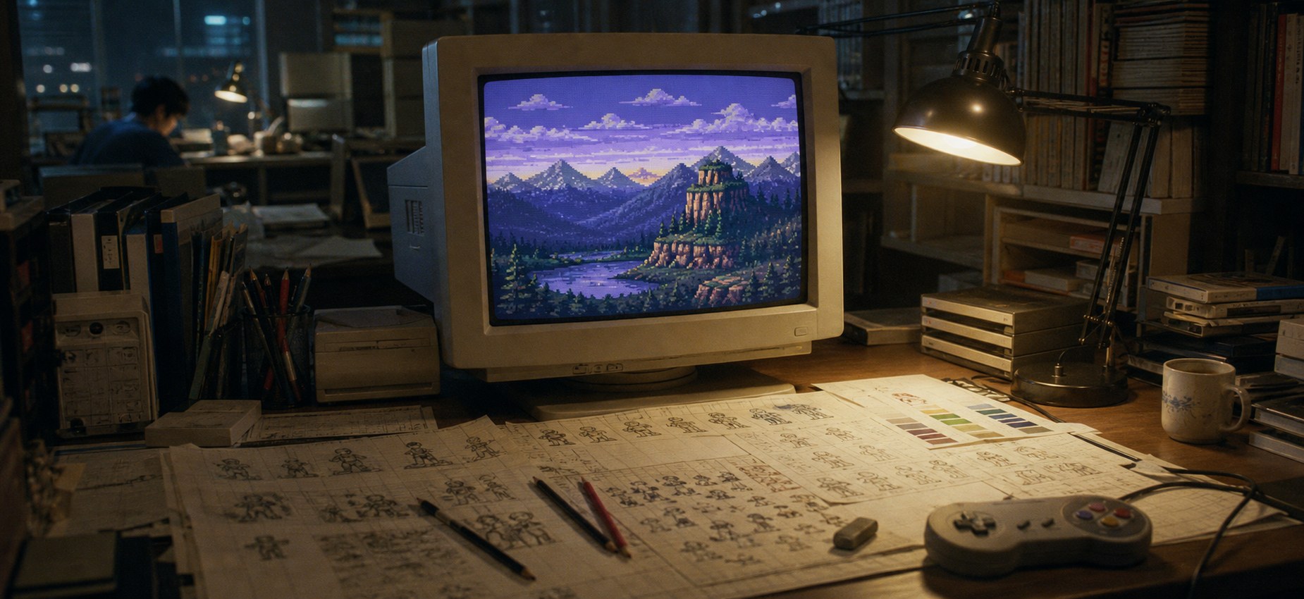
The exciting part is that those restrictions did not merely reduce what artists could draw. They changed how artists thought. A background could not simply be painted and dropped into a level. It had to repeat economically, scroll correctly, leave enough visual contrast for the player and fit beside every enemy, animation frame and interface element competing for cartridge space.
This is the story of how SNES artists created depth, colour and atmosphere when every pixel had a job.
First, forget the idea that 16-bit meant unlimited colour
Nintendo’s official hardware specifications describe a system capable of selecting from 32,768 colours, with up to 256 displayed on screen. That sounded enormous beside many earlier consoles—but it did not mean an artist could casually use any 256 colours anywhere.
Colours were organised into small palettes. Sprites and background tiles referenced those palettes rather than storing a unique colour for every pixel. One entry normally acted as transparency, so a nominal 16-colour sprite often had only 15 visible colours available. Multiple characters might need to share a palette, and changing one colour could affect several objects at once.
| Hardware fact | Artistic consequence | What players saw |
|---|---|---|
| 32,768-colour master range | Artists could select subtle hues, but only load a controlled subset | Richer mauves, teals, dusky blues and skin tones than many earlier systems |
| 256 colours on screen | Palette allocation had to be planned across backgrounds, sprites and effects | Scenes that feel colourful without becoming visually noisy |
| Tile-based backgrounds | Small reusable blocks had to join invisibly and serve more than one purpose | Large worlds built from surprisingly little unique artwork |
| Sprite and scanline limits | Characters needed compact silhouettes and controlled overlap | Occasional flicker, but also exceptionally readable action |
| Mode 7 | One flat background plane could be rotated and scaled | Racetracks, maps and dramatic pseudo-3D movement |
The limitation produced colour discipline. Instead of using ten unrelated greens in a forest, an artist might choose a short ramp that moved from a cool blue-green shadow to a warmer yellow-green highlight. That shift in hue makes a tiny object feel illuminated even when there are not enough colours for a smooth gradient.
Super Mario World: readability before decoration

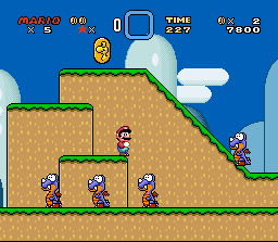
Super Mario World is a useful place to start because its art rarely tries to impress you with detail for its own sake. Mario’s sprite uses a strong dark outline, a small number of high-contrast colours and an instantly recognisable pose. Enemies are built around silhouettes you can identify before you consciously read their faces.
Look at the hierarchy of a typical level. The ground receives the firmest edges because it controls movement. Pickups and hazards use bright, isolated colours. Distant hills are softer and lower in contrast. Clouds are lighter still. The scene contains depth, but the player never has to ask which part is solid.
This is why apparently “simple” pixel art can be brutally difficult to reproduce. Adding texture everywhere is easy. Deciding where texture must stop is art direction. The game’s charm comes partly from the confidence to leave areas quiet.
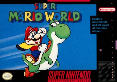
I have explored the game’s visual language more closely in Super Mario World pixel art: why the 16-bit style endures. The important lesson here is broader: SNES artists designed for recognition at speed, not for inspection in a static portfolio.
Tiles: the invisible machinery behind the picture
Most SNES backgrounds were assembled from small square tiles, commonly eight pixels by eight pixels. Larger visual chunks—cliffs, walls, trees, floors—were built by arranging those tiles into maps. Repeating a tile cost far less memory than storing a whole screen as a unique image.
The cleverness lies in hiding the repetition. A basic grass edge might be reused dozens of times, then interrupted with a flower, crack, root or differently shaded corner. Artists designed pieces that could connect in several combinations, almost like a visual construction set. Good tile art feels authored even when much of it is being recycled under your nose.
Tiles also encouraged strong local patterns. Bricks need a rhythm that survives repetition. Leaves need irregular clusters that do not form an obvious grid. Cavern walls need edge pieces for every likely turn. The player sees a landscape; the artist sees a library of reusable joins.
How backgrounds created depth without becoming 3D
The SNES could draw several background layers. Developers scrolled those layers at different speeds so nearby scenery moved faster than distant scenery—a technique known as parallax scrolling. Even two or three simple planes can create a convincing sense of distance because our eyes interpret the speed difference as depth.
Artists reinforced that illusion with value and colour. Foreground shapes tend to be darker, sharper and more saturated. Distant objects drift towards the colour of the sky, lose contrast and contain fewer internal details. This is essentially atmospheric perspective, a centuries-old painting principle, reconstructed with tiles.
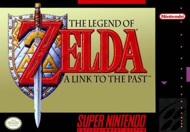
The Legend of Zelda: A Link to the Past demonstrates a different kind of depth. Its top-down world cannot rely on a realistic horizon, so walls, ledges and doorways use consistent edge shading. A bright upper edge and dark lower face tell us that one surface sits above another. The light is less important than the rule: once the rule is consistent, the player reads height instantly.
Mode 7: one flat picture performing a magic trick
Mode 7 is often described as “the SNES 3D mode”, but the phrase hides what makes it interesting. The hardware could rotate and scale a single background plane. Developers turned that flat plane into a racetrack, landscape or map, then placed conventional sprites over it.
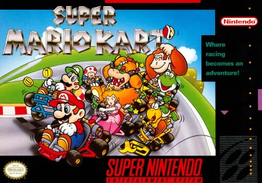
In Super Mario Kart, the track is effectively a textured sheet viewed in perspective. The racers, pipes, coins and hazards remain sprites. The illusion works because the artwork is designed for transformation: track markings are bold, edges are readable and distant details are simple enough to survive scaling.
The impressive part was not simply that the floor moved. It was that artists learned how to draw a floor that still communicated corners, shortcuts and hazards while being continuously stretched and rotated by the machine.
Transparency, colour maths and theatrical lighting
The SNES graphics hardware could combine layers mathematically. Developers used colour addition and subtraction, transparency and window effects for water, fog, spotlights, flashes and darkness. These were not free-form Photoshop layers; they were controlled operations applied to selected parts of the screen.
That encouraged theatrical lighting. Instead of repainting every object for an underwater scene, a translucent colour layer could pull the world towards blue. A circular window could reveal the bright scene beneath while the rest of the screen remained dark. Artists designed normal graphics and effects together, anticipating how colours would blend when the hardware combined them.
Donkey Kong Country and the shock of pre-rendered sprites
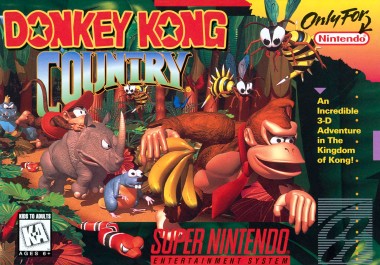
When Donkey Kong Country appeared in 1994, it looked like the console had suddenly learned a new language. Rare created character models in 3D workstations, rendered them as images, then converted those images into sprites and animation frames the SNES could display.
The result retained highlights, rounded shading and material cues associated with computer rendering. Yet the final assets still had to obey the console’s palette, memory and sprite rules. Pre-rendering did not remove pixel-art decisions; it moved those decisions into the conversion and clean-up stage. Fine shading had to survive reduction. Edges had to remain readable. Animation frames had to be selected carefully because cartridge space was not infinite.
Its influence was enormous, although not every imitation aged equally well. Rendered sprites could look muddy when tonal steps were compressed, whereas hand-designed sprites often used cleaner clusters and stronger silhouettes. That tension—volume versus clarity—is still relevant to pixel artists now.
Yoshi’s Island proved that pixel art did not need to look mechanical
Super Mario World 2: Yoshi’s Island pushed in almost the opposite direction. Its scenery looks drawn with crayons, pencils and felt tips. Lines wobble. Textures scribble across surfaces. Shapes appear cut from a child’s picture book.
It is still tile and sprite art. The handmade appearance comes from artists deliberately resisting perfect digital geometry while maintaining functional clarity. Platforms remain readable, characters still have strong silhouettes and animation still communicates danger. The game demonstrates that pixel art is a medium, not a single visual style.
The CRT television was part of the art pipeline
These graphics were designed to be viewed through analogue video on a cathode-ray television. Pixels did not appear as perfectly sharp modern squares. Scanlines, phosphor glow, signal softness and colour bleed changed the final image.
Artists could use alternating pixels—a technique called dithering—to suggest an intermediate tone. On a sharp display, the pattern is obvious. Through a CRT, neighbouring colours soften together. Thin highlight pixels glow. Jagged diagonal edges appear less severe. In other words, the television completed part of the rendering.
This does not mean modern displays are “wrong”, but it explains why raw screenshots can look harsher than memory. We remember the designed image and the display behaviour as one experience.
Why SNES pixel art still matters
The strongest SNES art remains compelling because it solves communication problems elegantly. It tells us what is solid, what is dangerous, what is distant and what deserves attention before we have time to analyse the picture.
- Limited palettes encouraged deliberate colour relationships.
- Tile reuse made artists design flexible visual systems rather than isolated paintings.
- Sprite constraints rewarded recognisable silhouettes and economical animation.
- Layer effects turned flat artwork into atmosphere and depth.
- CRT presentation allowed patterns and edges to blend in the viewer’s eye.
Modern pixel artists are no longer forced to obey the same limits, but they still borrow the visual logic. The lesson is not to imitate every technical restriction. It is to understand how restriction produced focus.
That same logic is one reason physical layered art works well with game scenes: foregrounds, characters and backgrounds already have a strong visual hierarchy. You can see how I translate one of those scenes into cardstock depth in the Super Mario World shadow-box article, or browse more features in Game Art & Culture.
Frequently asked questions
How many colours could the SNES display?
Nintendo’s published specification lists a 32,768-colour range and 256 colours on screen. In practice, artists worked with smaller assigned palettes for tiles and sprites, so colour planning remained strict.
Was SNES artwork drawn pixel by pixel?
Much of it was created and refined at pixel level, but workflows varied. Artwork might begin as sketches, painted concepts or—famously in Donkey Kong Country—rendered 3D models before being converted and cleaned for the console.
What did Mode 7 actually do?
Mode 7 allowed one background plane to be rotated and scaled. Games used it for racetracks, maps and dramatic movement, combining the transformed plane with ordinary sprites and other effects.
Why does SNES pixel art look different on a modern screen?
Original graphics were viewed through analogue video on CRT televisions, where scanlines, glow and colour blending softened pixel patterns. Modern displays often show the source pixels with much sharper boundaries.
The other 16-bit accent
The SNES was only half of the 16-bit visual conversation. For the sharper, higher-contrast counterpart, read why Mega Drive graphics often looked darker and sharper—and how Sega artists used tighter palettes, dithering and CRT output as part of the style.
Sources and image notes
Hardware figures are taken from Nintendo UK’s Super Nintendo technical details. Game availability and official artwork are referenced from Nintendo’s Super Nintendo Entertainment System – Nintendo Classics catalogue. Gameplay screenshots and official artwork are reproduced in reduced form for identification, criticism and visual analysis; their respective games and imagery remain the property of their copyright holders.