
Cadillacs and Dinosaurs is one of Capcom’s most visually distinctive arcade beat ’em ups. Released in 1993 and based on Mark Schultz’s Xenozoic Tales, it combines ruined cities, 1950s American cars, comic-book heroes and roaming dinosaurs in a world that should feel chaotic—but is held together by remarkably clear pixel art.
This is not simply a nostalgic look at an old arcade game. It is an examination of how Capcom used silhouettes, colour, animation and environmental detail to make a crowded action game readable at a glance—and why those choices still make its artwork memorable.
What Is Cadillacs and Dinosaurs?
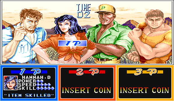
Cadillacs and Dinosaurs is a side-scrolling arcade beat ’em up developed and published by Capcom. Up to three players move through a post-apocalyptic future in which human settlements, old technology and prehistoric animals coexist. Its four playable characters—Jack Tenrec, Hannah Dundee, Mustapha Cairo and Mess O’Bradovich—have different balances of speed, strength and reach.
The game belongs to the same broad arcade tradition as Final Fight, but its source material gives it a stranger and more varied visual vocabulary. Street gangs share the screen with dinosaurs. Derelict industrial spaces give way to jungle, desert and underground environments. A polished Cadillac becomes both a symbol of the world and a playable vehicle.


A Comic-Book World Built from Pixels
The visual design works because it does not attempt to make every surface equally realistic. Instead, it borrows the priorities of comic-book illustration: strong outlines, controlled areas of shadow, expressive poses and carefully chosen colour contrasts. Faces and clothing contain enough detail to suggest personality without becoming noisy at normal arcade scale.
Capcom’s CPS-1 hardware was built for colourful 2D arcade graphics, but technical capability alone does not explain the game’s look. The artists continually decide what information the player needs first. A character’s silhouette must remain visible against a busy background. An attack must be readable before it connects. An enemy must look different from the hero even when several sprites overlap.
Character Silhouettes and Instant Readability
Each playable character communicates a role before the player studies any statistics. Mess has the broadest, heaviest silhouette. Mustapha’s long-legged stance suggests reach and movement. Hannah is compact and agile, while Jack occupies a balanced middle ground. Clothing colour, body shape and idle animation reinforce those differences.
This matters in a multiplayer brawler. The screen can contain heroes, enemies, weapons, effects and scenery simultaneously. If every figure used similar proportions and values, the action would become difficult to follow. The large sprites are impressive, but their clarity is the more important achievement.
Colour, Shading and the Feeling of Impact
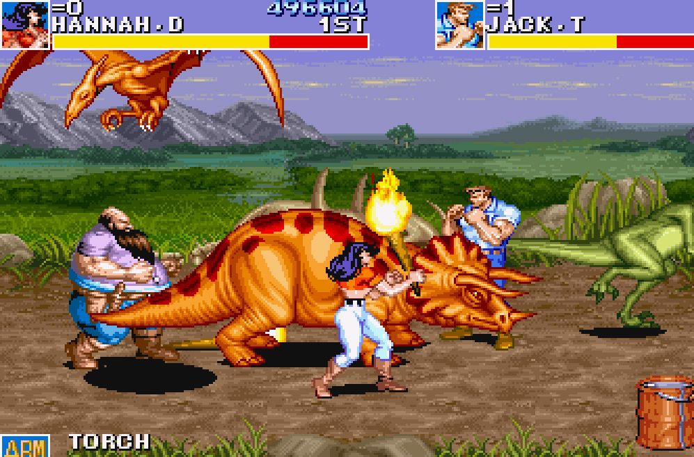
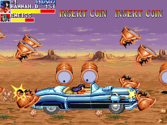
The game uses bold clusters of light and shadow rather than smooth tonal transitions. That gives muscles, fabric and machinery a carved appearance. High-value highlights catch the edge of a jacket or vehicle; deep shadows separate limbs and make poses legible. Because the shading is deliberate, the sprites feel substantial without losing their pixel structure.
Animation completes the effect. Anticipation frames prepare a strike, contact frames exaggerate the collision and recovery frames return the character to a readable stance. Enemies recoil, fall and crowd one another in ways that make each hit feel weighty. The artwork is not decoration added to the combat: it is how the combat communicates.
Why the Dinosaurs Change the Composition
Dinosaurs interrupt the familiar scale of the human brawler. Their bodies can occupy a much larger part of the screen, and their movement is less predictable than a gang member walking into formation. This creates visual drama, but it also requires careful hierarchy. A dinosaur must look powerful without obscuring every other important element.
The contrast is central to the game’s appeal. Human characters are designed around martial-arts poses and comic-book anatomy; dinosaurs are built around mass, tails, jaws and animal movement. Placing the two systems together makes the world feel unusual even before the story is understood.
Background Art That Tells the Story
Ruined streets, machinery, vegetation, workshops and abandoned infrastructure explain the setting without long passages of text. Old technology has not disappeared, but nature has reclaimed much of the world. The famous Cadillac is therefore more than a visual joke: its polished curves and chrome represent survival, restoration and a stubborn attachment to the past.
Background palettes are usually controlled so the playable space remains clear. Decorative detail is pushed away from the strongest character values, while floors and walls help define where combat can happen. This balance between atmosphere and function is one reason the stages remain easy to read despite their density.
From Arcade Screen to Layered Pixel Art
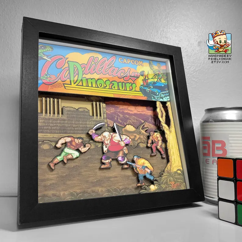
Turning one of these scenes into physical layered art involves more than cutting around every visible object. The important decision is depth hierarchy: which character belongs in the foreground, which effects need a small separation, and which background shapes should remain visually connected.
Too little separation produces a flat print. Too much separation can make the composition feel disconnected from the compact arcade image. The best result preserves Capcom’s original silhouette and colour relationships while allowing real light to create subtle shadows between the layers.
For the practical companion to this visual analysis, see the Cadillacs and Dinosaurs shadow-box artwork. It focuses on the selected scenes and how they translate into a physical display.
Why Its Pixel Art Still Bites
Cadillacs and Dinosaurs remains visually convincing because its artists designed for communication first. Large sprites have unmistakable silhouettes. Shading gives them weight. Animation explains force and timing. Backgrounds establish a strange world while protecting the clarity of the action.
That discipline gives the game a stronger identity than technical detail alone could provide. It is a useful example of why memorable pixel art is not defined by how many pixels an artist can fill, but by how deliberately every cluster, colour and movement supports the experience.
Continue with the visual design of Super Mario World, explore how Splatterhouse 2 created horror in 16 bits, or browse the Game Art & Culture archive.
If you are looking for the handmade artwork rather than the visual history, current pieces are available through the Pixel King UK Etsy shop.